Table of Contents
All the organisations we work with are purpose driven. Income matters, but only because it sustains the bigger goal: creating impact. Funders, donors and governments increasingly want to know not just what you’ve delivered, but what difference it made. That makes measuring success complicated — especially for digital teams, where outcomes can feel hard to pin down.
- How can we demonstrate the value and impact of our digital work?
- How can we make a case for greater investment in digital content?
- How can we stop or change what isn’t working?
Through a series of research projects – including an evaluation of 57 digital initiatives across the UK, USA and Asia for Bloomberg Philanthropies – we set out to answer these questions. Our aim was clear: to create a practical way to design for, and measure, positive impact. We wanted a method that was evidence-based and easy to use. Something simple enough for content teams to use day-to-day, yet robust enough to stand up in strategy papers and funding cases.
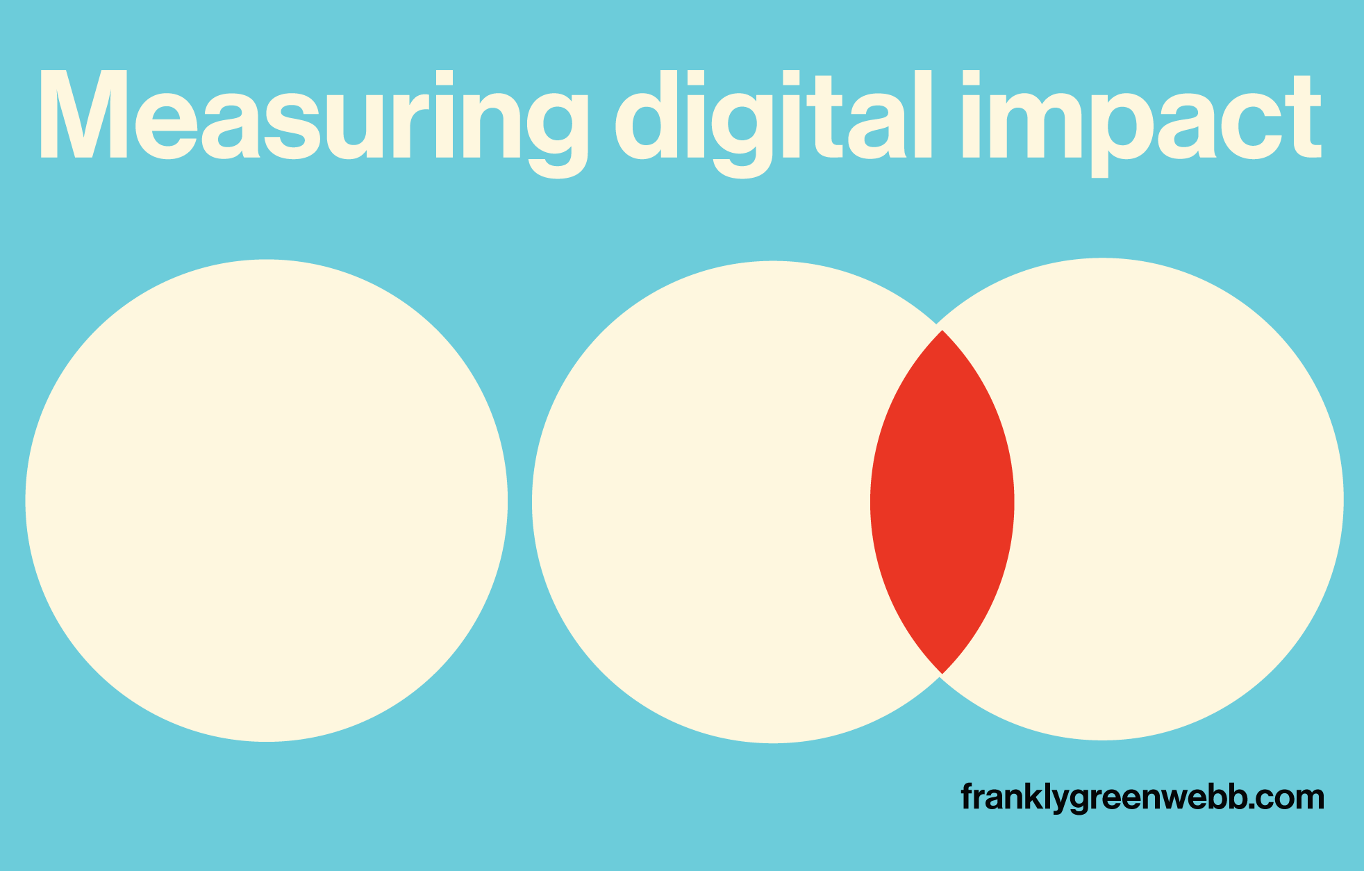
One thing became clear early on: “impact” can feel abstract. It’s a term often used without a shared understanding of what it means or how to spot it in the wild. We realised that impact is a combination of two things:
Reach x Effect = Impact
Reach is about how many people you connect with. Effect is about the change you create for those people. Some projects reach a lot of people and create a small change. Others reach a small group but make a big difference. Both have value – what we all want to avoid is low reach and low effect.
Measuring effect
To understand the impact of digital content, we separated reach from effect. While many studies look at effect from a community or societal perspective, we wanted to focus on the individual. What effect does digital content have on users and followers? This helps us understand not just scale of effect, but also whether some audiences are experiencing more (or less) benefit than others.
We aimed to capture both the outcomes most cultural organisations typically seek—such as improving understanding or creating enjoyable experiences—and a wider set of effects that might also hold value for audiences and organisations.
We also wanted a consistent set of measures that could be applied across organisations, enabling comparison and shared learning across the sector.
Finding a model
In our research around different models and ways to measure impact, the New Economics Foundation’s Five Ways to Wellbeing stood out. First developed in 2008, this evidence-based framework is widely used by the NHS, charities, community groups and funders. It’s simple, flexible, and easy to adapt.
The Five Ways are:
- Keep learning: Trying/learning something new or discovering an interest builds confidence and enjoyment.
- Be curious: Paying attention to the world and noticing the beautiful, the unusual, what has changed, helps people appreciate what matters to them.
- Connect: Building relationships with people and organisations enriches everyday life.
- Give: Helping others—whether by volunteering, sharing skills or giving time—creates purpose and belonging.
- Be active: Movement in any form, from walking to dancing, supports wellbeing and is accessible to most.
What struck us is how effective this framework could be as a lens for digital cultural content. We can ask: Did this content help someone learn, notice more, connect, give, or get active? Each action has value and relevance to both individuals and organisations, but together they offer a powerful way to understand how digital content can contribute to wellbeing.
Creating a Sector-Specific Tool
Using the five ways as a foundation, we developed a set of simple, user-friendly statements for surveys..
We’ve now used these indicators across multiple surveys, covering web and social media channels for a wide range of museums and heritage organisations, building a dataset of nearly 40,000 responses.
I’ll share some key results in a future post around how they’ve helped teams to develop content but also revealed some of the biases within our sector – types of content and effect that we rely on and while others are less well used but could, nevertheless, be powerful.
Putting it into practice?
If you’d like to see what this looks like in action, read how the National Trust for Scotland used audience insight to transform their social media engagement.
“Since this research, which has completely changed our approach, we’ve seen a noticeable, positive impact against KPIs: reach, engagements, audience growth rate, amplification rate—all have increased significantly.” Read the case study
Curious about how the Reach × Effect model is being applied and what results we’re seeing?
Book an UnOffice Hour to talk it through.
Or sign up to our newsletter for more on what we’re learning and how others are putting these ideas into practice.
